Branding
Digital Design
Art Direction
Task:
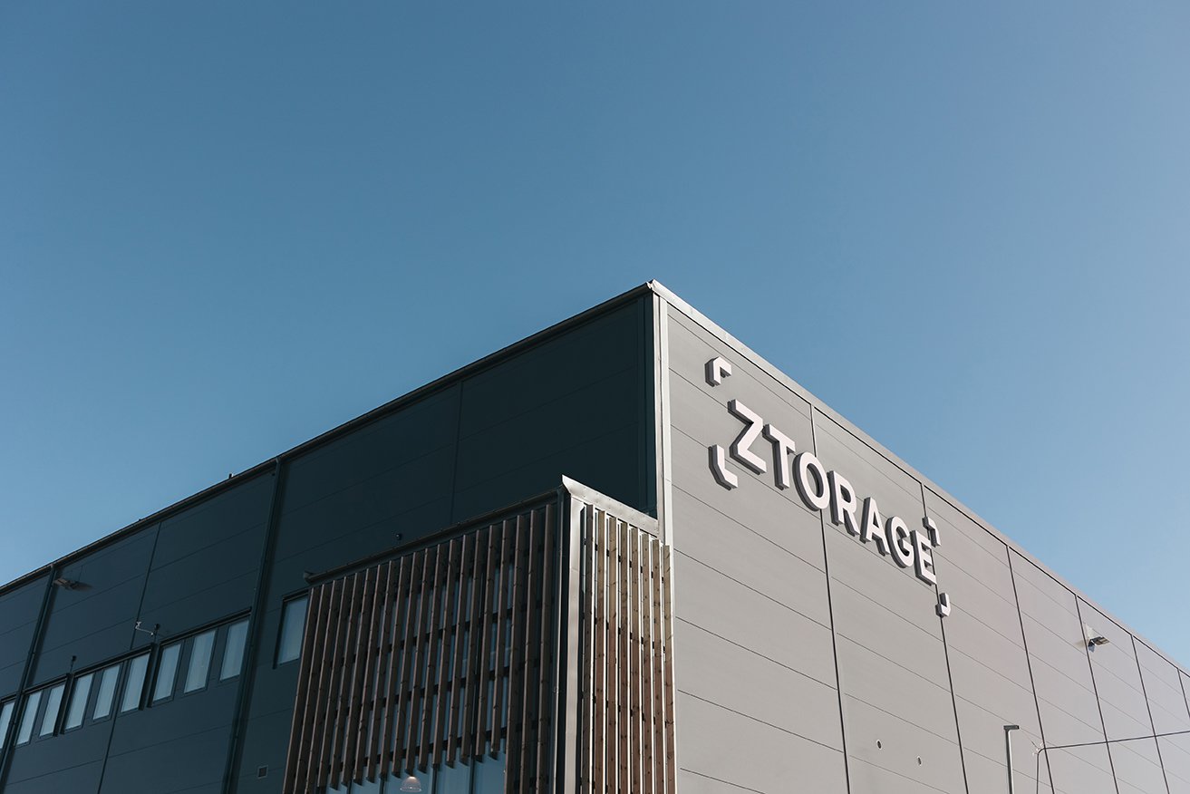
Ztorage is a storage company that sought to take a fresh approach to its graphic identity, aligning with its expansion while embracing a more contemporary and digitally-oriented presence.
Approach:
The idea was to let the old profile endure but with a new perspective. The logo has been modernized, establishing a direct connection to the service. Colors play a significant role in the identity, with the updated pink serving as a modern twist on their previous pink, which held a crucial role in their identity.


