Client:
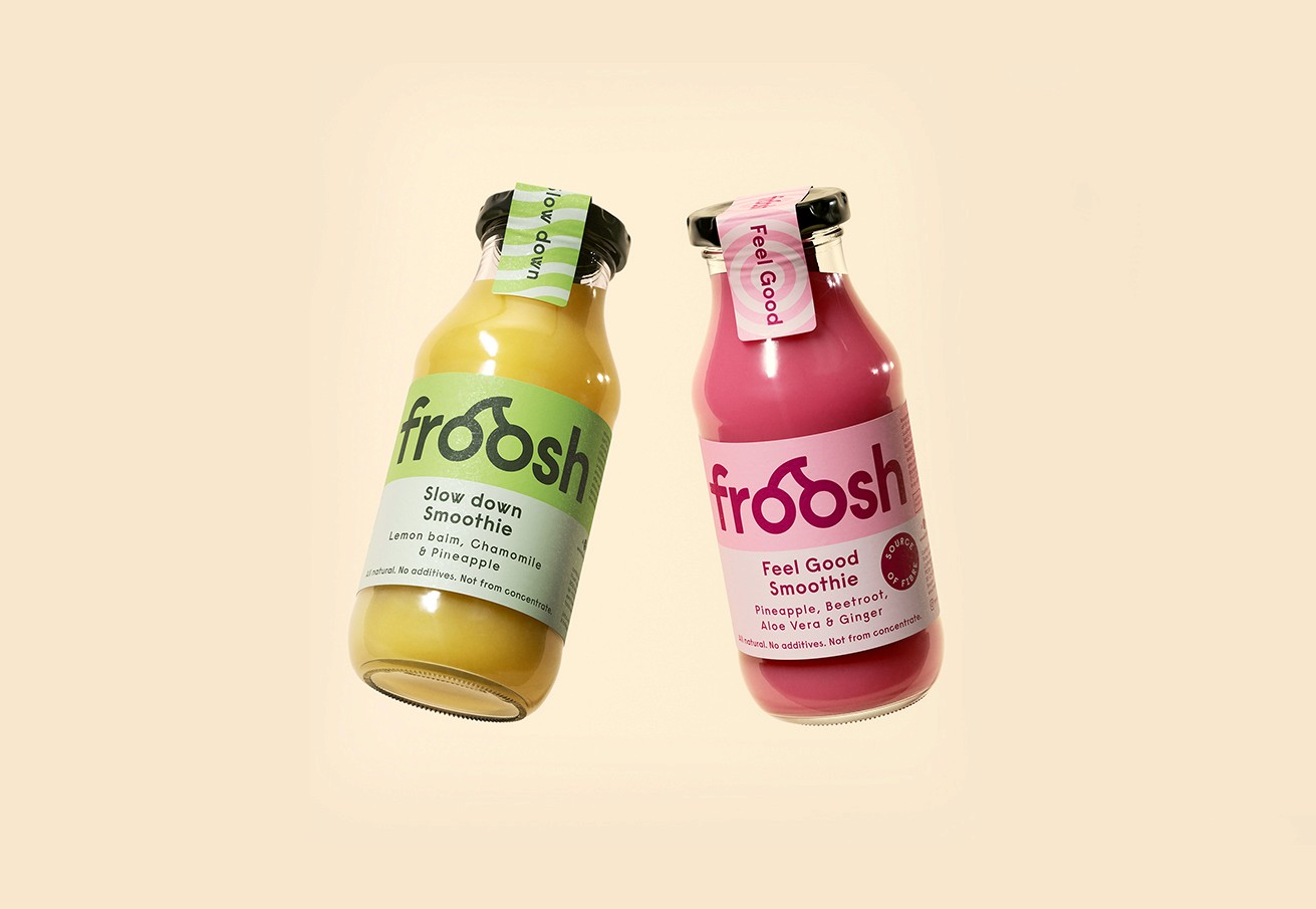
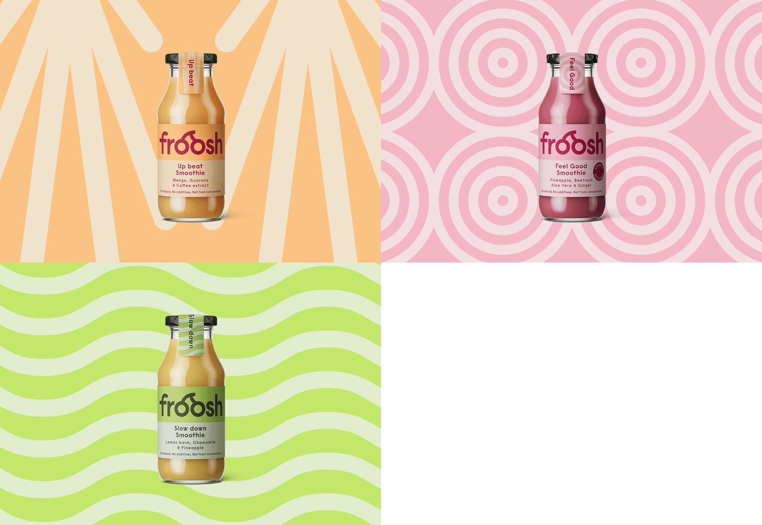
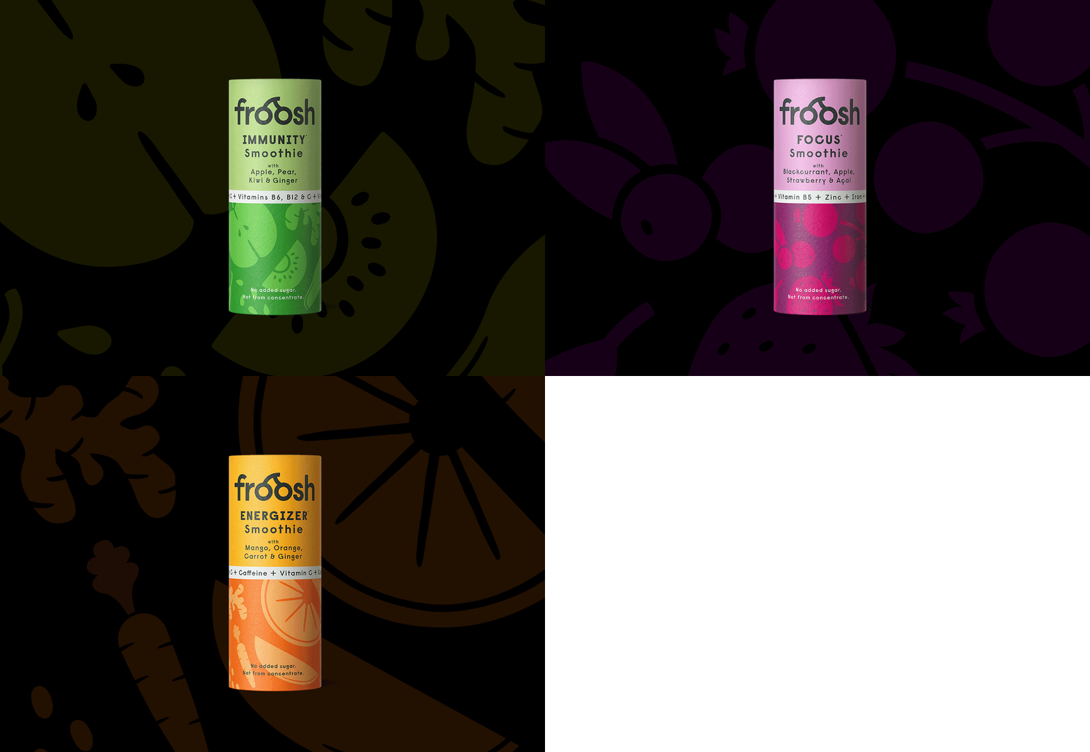
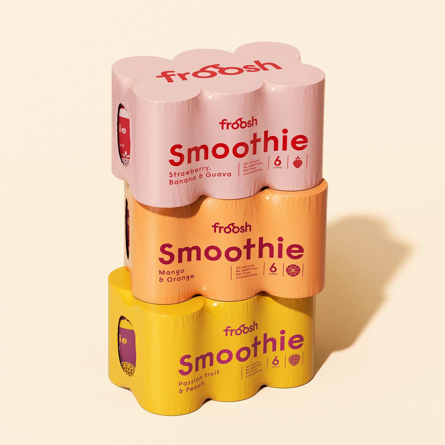
Froosh is a well-known smoothie brand that needed a fresh approach for its packaging. The existing design posed issues of lacking clarity and quick recognition on the shelf.
Client:
Froosh is a well-known smoothie brand that needed a fresh approach for its packaging. The existing design posed issues of lacking clarity and quick recognition on the shelf.
Approach:
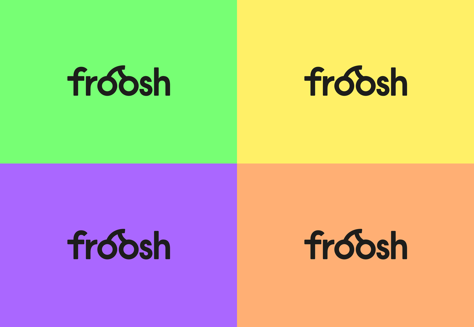
The idea was to truly establish Froosh as a prominent brand by simplifying and clarifying its core values. Allowing the logo to take a prominent role on the packaging aimed to create brand presence and stand out on the shelf. The two-part solution and bold colors contribute to a distinctive and timeless design.
