Client:
Ztorage is a storage company that sought to take a fresh approach to its graphic identity, aligning with its expansion while embracing a more contemporary and digitally-oriented presence.
Client:
Ztorage is a storage company that sought to take a fresh approach to its graphic identity, aligning with its expansion while embracing a more contemporary and digitally-oriented presence.
Approach:
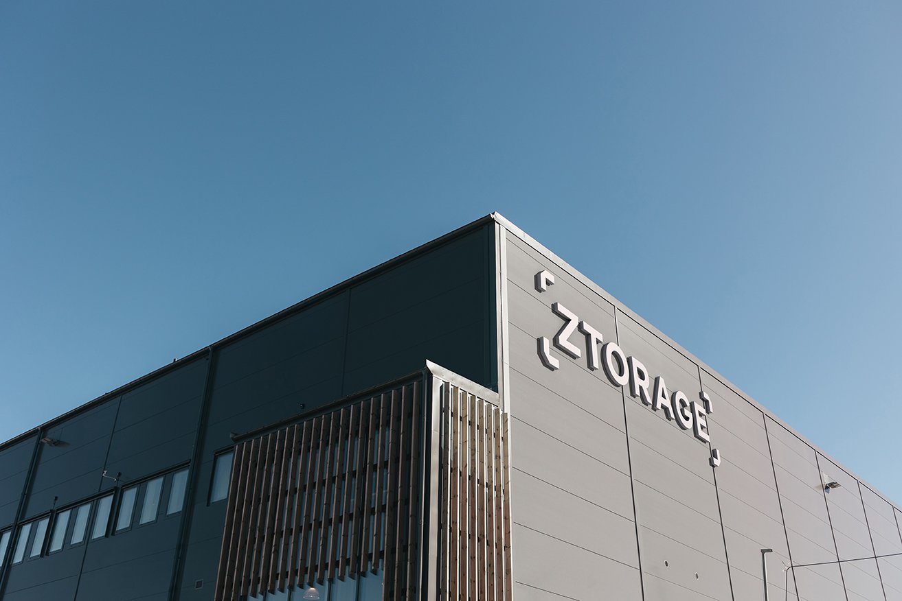
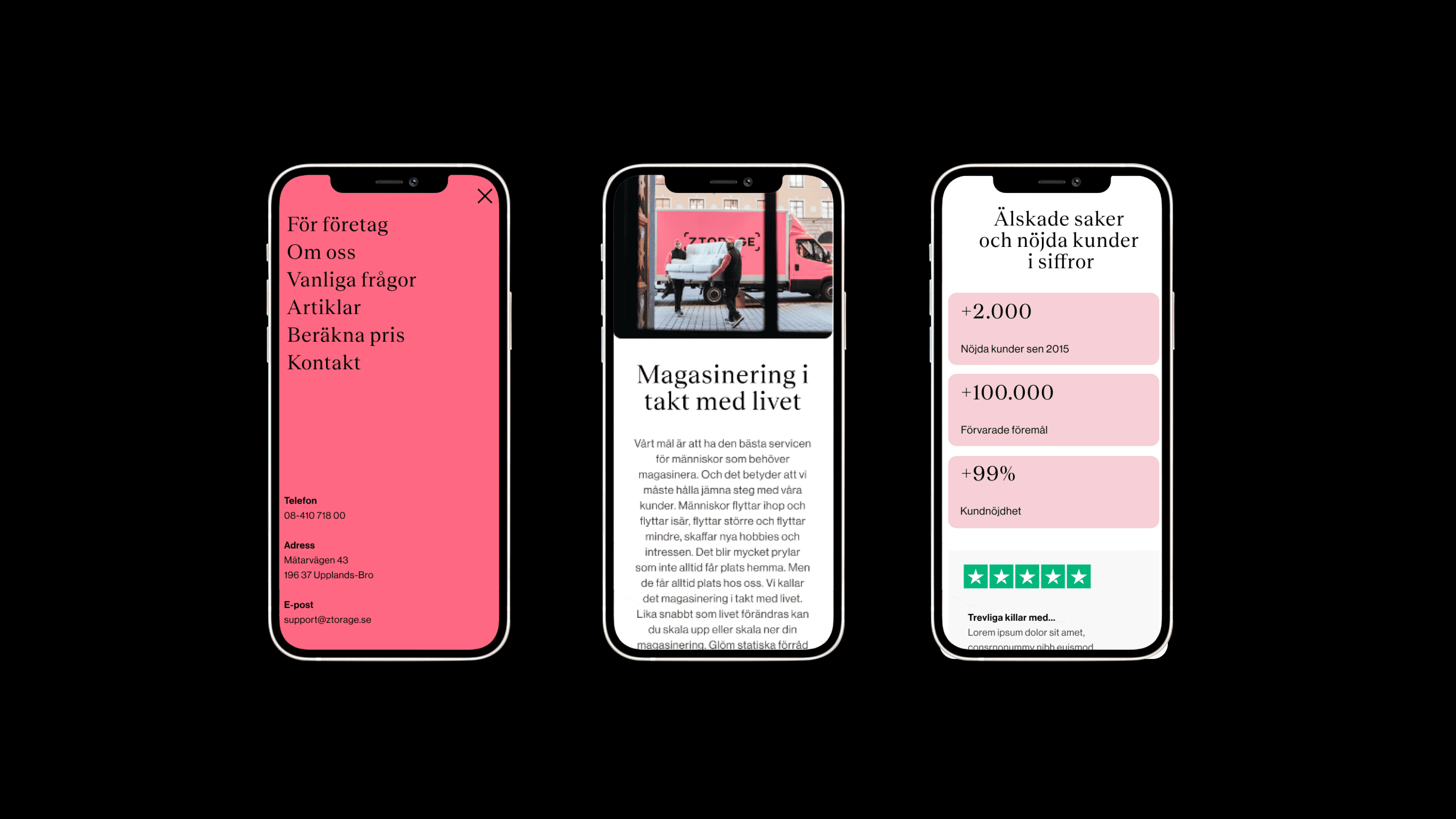
The goal was to preserve the old profile with a fresh perspective. The logo was modernized to link directly to the service. Colors are key, with the updated pink offering a modern take on their previous signature shade.
Approach:
The goal was to preserve the old profile with a fresh perspective. The logo was modernized to link directly to the service. Colors are key, with the updated pink offering a modern take on their previous signature shade.


